Quick Color Painting Tutorial
Added 2018-08-16 21:16:57 +0000 UTCI had a few questions asking how to think about color. That's a topic that is too big for any 1 post, but I wanted to atleast show people a way to paint that's quick and hard to mess up. You won't get a deep understanding of how to think about colors while you're painting by doing this exercise, but atleast you'll gain a bit of intuition, and I'll do my best to explain what I'm doing and why I'm making certain decisions. Without further ado, here's a quick way to paint that's hard to mess up;
-----
Step 1: Line Color
First step is to decide a good line color. For this exercise I'm going to assume the lighting as being full of bright warm light. And to reflect that I want to use a warm golden color for my line color.

A trick I like to use when sketching out a painting is that I change the brush's blend mode to multiply. That means every brush stroke I put down will multiply whatever is already in that layer. Don't get this step confused with turning on multiply on the layer. You should do that too for this exercise, but what you're looking for is at the top of the screen when you have a brush selected.

Remember when you select a color for your lines don't select a color that is full saturation. You need a black value in there that will eventually multiply the color to black. If the black value is 0, it can only multiply to 0. Test out your brush and make sure the color ramping is to your liking.

If my colors look like above, I'm happy with it and I sketch out my drawing.

I like to use the multiply mode on my brush because the linework doesn't look flat in the end. There's a large variety of color just in the sketch stage, but not SO much variety it looks uncontrolled.
Step 2: Under Paint
After I loosely sketch out what I'm trying to draw, I put an under painting on the layer underneath. The under painting is nothing too special. It just gives me a baseline for how dark things can get and how light things can get. Choose a neutral brown that's about 50% in darkness and put it behind your line drawing.


Make sure the line drawing layer is on multiply, and I like to make the under painting about 5 pixels smaller than the line drawing. Those tiny flecks of gold peaking out from the under painting make all the difference.
Step 3: Color
At this point make another layer. Put it between the under painting and the linework. You're going to put the colors of the painting here.


I don't like to use a paint bucket tool here. Slight imperfections is what you want, and the under painting peaking through the color is what ensures that all your colors have something in common, and seem consistent. I use a soft round brush that's slightly smaller than what's comfortable. This makes blocking out colors more labor intensive, but in my opinion it's worth it.
Step 4: Shading
When it comes to shading, of course I worry about what would be a realistic way of shading, but I'm more concerned about what would bring out the most fun colors, and would give me the most to play around with during the clean up phase. For this exercise, I use a warm pink hue.

Using a single color for all your shading is another way to unify all the colors. And the pink hue multiplied on the blue hair and the light skin always gives fun results. don't try to over render stuff at this stage. Just go for bold decisions.
Step 5: Clean up
There's not a whole lot to explain about this step. If you've followed the above steps there's going to invariably be parts of the painting you don't like. Time to go clean them up! Again, don't go overboard in cleaning stuff up. Remember that it's a never ending process if you get obsessed with the details. I use part to make minute adjustments in key select areas. Don't forget it's the flaws that make it look human.

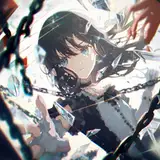
If you want to dig around the PSD and see what colors I used or just want to see what each layer looks like, I'll be attaching it to this post. Have fun!